Your Shopify store’s cart and checkout pages represent the most valuable real estate in your entire business. Visitors who reach these pages have already decided to buy, they’ve browsed your site, evaluated products, selected items, and clicked “add to cart.” They’re 60-80% of the way to completing a purchase. Baymard Institute’s meta-analysis of 49 cart abandonment studies puts the global average cart abandonment rate at 70.19%, and their analysis of US and EU ecommerce ($738 billion combined) estimates $260 billion in lost orders are recoverable solely through better checkout flow and design, per Baymard Institute, 50 Cart Abandonment Rate Statistics.
Yet the average eCommerce cart abandonment rate is 69.8%, according to the Baymard Institute. That means for every 100 people who add items to their cart, 70 leave without buying. For a store with 1,000 monthly cart additions and a $75 average order value, that’s $52,500 in abandoned revenue every single month, $630,000 annually.
The gap between potential revenue and actual revenue is the cost of cart and checkout friction.
This guide reveals the 15 highest-impact optimizations that reduce cart abandonment and increase checkout completion rates. These aren’t theoretical best practices, they’re proven interventions that address the specific reasons customers abandon carts, backed by conversion research and implementation data showing 30-50% recovery of previously lost sales. Mobile cart abandonment rate is 77.06%, compared to 70.01% on desktop, a 7-point gap that reflects the greater friction of entering payment information on small screens and the importance of express checkout options like Apple Pay and Google Pay, per ZeroCart, Cart Abandonment Rate 2025: 70.22%, Industry & Device Breakdown.
Each optimisation includes the abandonment trigger it eliminates, implementation methodology, and expected impact on your bottom line.
Understanding Why Customers Abandon Carts
Before optimising, understand the root causes. Baymard Institute’s research analyzing 49 cart abandonment studies reveals the top reasons: 48% of shoppers abandon carts because of unexpected costs revealed at checkout, making it the leading single cause of abandonment, above slow delivery (24%), required account creation (26%), and payment method limitations (13%), per Opensend, 7 Cart Abandonment Rate Statistics for eCommerce Stores.
1. Unexpected costs (48% of abandoners) Shipping fees, taxes, or handling charges that appear late in checkout surprise customers and trigger abandonment. If a $50 product suddenly becomes $63.99 at checkout, trust breaks and purchases stall.
2. Forced account creation (24% of abandoners) Requiring customers to create an account before purchase adds friction. First-time buyers just want to complete their transaction, they’ll create accounts later if the experience is good.
3. Long or complicated checkout (21% of abandoners) Forms requesting unnecessary information, multi-step processes with unclear progress, and confusing error messages create cognitive friction that overwhelms purchase intent. The average checkout flow across major ecommerce sites contains 5.1 steps and 11.3 form fields by default, Baymard’s benchmarks show that reducing form fields and steps directly correlates with checkout completion rate improvements, per Growth Engines, Checkout optimisation: Recover 35% of Abandoned Carts.
4. Security concerns (19% of abandoners) Entering credit card information on unfamiliar websites triggers legitimate caution. Without clear security signals, risk-averse buyers abandon rather than risk fraud.
5. Delivery timeline uncertainty (18% of abandoners) Not knowing when products will arrive creates hesitation, especially for time-sensitive purchases (gifts, events, urgent needs).
6. Limited payment options (13% of abandoners) If customers can’t pay with their preferred method (PayPal, Apple Pay, BNPL), they abandon to find retailers who accept it.
7. Website errors or crashes (11% of abandoners) Technical issues during checkout, slow loading, form errors, payment processing failures, create frustration and lost sales.
8. No clear return policy (8% of abandoners) Purchase feels risky without understanding return/refund options. Unclear policies create last-moment hesitation.
Every optimisation in this guide eliminates one or more of these triggers.
The Cart and Checkout Funnel: Where Revenue Leaks
Your conversion funnel has three critical stages where revenue leaks:
Stage 1: Product Page → Add to Cart Baseline: 8-12% of product page visitors add to cart optimised: 15-20% Leak: Product page issues (covered in previous guide)
Stage 2: Cart Page → Checkout Initiated Baseline: 50-65% proceed from cart to checkout optimised: 70-85% Leak: Cart page friction, shipping surprises, exit distractions
Stage 3: Checkout → Order Completed Baseline: 30-45% complete purchase optimised: 60-80% Leak: Checkout friction, payment issues, trust concerns
Example math for store with 10,000 monthly product page visitors:
Before optimisation:
- Add-to-cart rate: 10% = 1,000 cart additions
- Cart-to-checkout rate: 60% = 600 checkout initiations
- Checkout completion rate: 40% = 240 orders
- Overall conversion: 2.4%
After optimisation:
- Add-to-cart rate: 15% = 1,500 cart additions
- Cart-to-checkout rate: 75% = 1,125 checkout initiations
- Checkout completion rate: 65% = 731 orders
- Overall conversion: 7.31%
Impact at $75 AOV:
- Before: $18,000 monthly revenue
- After: $54,825 monthly revenue
- Increase: $36,825/month or $441,900 annually
The following 15 optimizations systematically plug these leaks.
Cart Page Optimizations
Your cart page serves two purposes: confirm what’s being purchased and to remove obstacles to checkout. Optimize for both.
optimisation 1: Crystal-Clear Cart Summary
Abandonment trigger eliminated: Confusion about what’s being purchased
What it is: Comprehensive display of all cart contents with complete product information, pricing transparency, and easy editing capability.
Why it matters:
Customers need to verify they’re buying the correct items before proceeding to payment. Any uncertainty triggers hesitation. If they can’t quickly confirm product details, quantities, sizes, or colours, they’ll resort to “double-checking” and may not return.
Additionally, cart clarity reduces post-purchase returns. When customers clearly see what they’re ordering, buyer’s remorse and returns due to “this isn’t what I thought I ordered” decrease significantly.
How to implement effectively:
Essential cart line items:
For each product in the cart, display:
- Product thumbnail image (clickable to return to product page)
- Shows exactly what they’re buying
- Visual confirmation prevents size/colour mistakes
- Full product name with variant details
- “Men’s Cotton T-Shirt – Navy Blue – Large”
- Not just “Cotton T-Shirt” (which variant?)
- Individual unit price
- Shows price per item
- Important for quantity verification
- Quantity selector (editable +/- buttons or input)
- Easy adjustment without leaving the cart
- Updates line total and cart total in real-time
- Line item total
- Unit price × quantity
- Shows total for this item
- Remove/delete option
- Clear X icon or “Remove” link
- No confirmation modal needed (can undo by re-adding)
Cart total breakdown:
Display running totals clearly:
Subtotal: $127.50
Shipping: Calculated at checkout
Tax: Calculated at checkout
-------------------
Estimated Total: $127.50+
Why “calculated at checkout” for shipping/tax: Can’t calculate without an address. Clearly state this rather than showing $0.00 (which sets false expectations).
Better approach: Offer shipping calculator on cart page (covered in optimisation 3). Baymard Institute’s checkout usability research found the average ecommerce site can gain a 35.26% increase in checkout conversion rate through better checkout design, the single highest-ROI improvement available to most stores, per Baymard Institute, E-Commerce Cart & Checkout Usability Research.
Quantity update behaviour:
When the customer changes quantity:
- Update line total immediately (no page reload)
- Update cart total immediately
- Show brief “Cart updated” confirmation
- Persist changes (don’t lose on page refresh)
Empty cart state:
If cart is empty, show:
- “Your cart is empty” message
- Featured products or bestsellers (“You might like…”)
- Link back to shopping/collections
- Don’t just show a blank page
Expected impact:
- Clear cart display reduces cart abandonment by 8-12%
- Easy quantity editing increases average order value by 3-5% (customers add more when it’s friction-free)
- Proper product detail display reduces returns by 12-18%
optimisation 2: Remove Distractions (Simplified Navigation)
Abandonment trigger eliminated: Exit paths that pull customers away from checkout
What it is: Streamlined cart page design that removes or minimizes navigation elements, reducing opportunities to leave the purchase funnel.
Why it matters:
Every link on your cart page is a potential exit. Full site navigation gives customers hundreds of opportunities to get distracted and abandon their purchases. While some exploration is natural earlier in the journey, cart visitors have high purchase intent, your job is to guide them toward checkout, not offer detours.
Eye-tracking studies show that even engaged buyers will click navigation if it’s prominent. Each click away from the cart reduces the probability of return by 15-20%.
How to implement effectively:
Navigation simplification options:
Option 1: Minimal header (recommended)
- Keep logo (links to homepage)
- Remove the main navigation menu
- Remove search bar
- Keep only: Help/Contact, Cart icon (current page)
Option 2: Sticky checkout CTA header
- Condensed header with logo
- Prominent “Proceed to Checkout” button in header
- Removes all other navigation
Option 3: Full removal (aggressive)
- Remove header entirely
- Show only cart contents and checkout button
- Used by high-conversion DTC brands
What to keep:
- Security badges (builds trust)
- Customer service contact (reduces anxiety)
- Cart icon/count (shows current state)
What to remove:
- Main product navigation
- Collection links
- Search functionality
- Secondary pages (About, Blog, etc.)
- Social media links
- Newsletter signup forms
Footer simplification:
Remove from cart page footer:
- Extensive link lists
- Newsletter signup
- Social media links
- Secondary navigation
Keep in cart page footer:
- Essential legal (Privacy Policy, Terms)
- Security badges
- Contact information
- Return policy link
Progressive disclosure:
If you must keep some navigation (brand standards, legal requirements):
- Make it less prominent (smaller, lower contrast)
- Position below the fold
- Use minimal styling
Primary visual attention should go to:
- Cart contents
- Checkout button
- Trust signals
Mobile cart simplification:
Even more critical on mobile:
- Hide hamburger menu on cart page
- Remove all nav except back arrow or logo
- Full-width checkout button (no competing CTAs)
Testing consideration:
A/B test navigation removal. Some brands find that minimal navigation performs better (guides focus), others find it creates anxiety (feels restrictive). Test with your audience.
Expected impact:
- Removing navigation reduces cart abandonment by 10-18%
- Simplified cart pages see 15-25% higher cart-to-checkout progression rates
- Greatest impact for stores with complex navigation or large product catalogs
optimisation 3: Shipping Cost Transparency and Calculator
Abandonment trigger eliminated: Unexpected shipping costs (the #1 abandonment reason)
What it is: Upfront communication of shipping costs with the ability to calculate exact shipping before entering checkout.
Why it matters:
48% of cart abandoners cite unexpected costs as the reason they left. When customers see their subtotal as $75 on the cart page, they mentally commit to that price. If checkout reveals $12.99 shipping they weren’t expecting, the total jumps to $87.99, a 17% increase that feels like bait-and-switch.
Shipping cost surprises break trust and trigger immediate abandonment, often permanently (customers don’t return even if they cool off).
How to implement effectively:
Ideal: Free shipping
If your margins support it:
- “FREE SHIPPING on all orders”
- No calculator needed
- Highest conversion rates
If free shipping isn’t viable:
Option 1: Free shipping threshold
Most effective psychological approach:
🚚 Add $23 more for FREE SHIPPING

Subtotal: $52.00
Free shipping at: $75.00
You're $23.00 away!
Benefits:
- Increases average order value (customers add items to hit the threshold)
- Reduces abandonment (shipping feels earned, not imposed)
- Progress bar creates gamification
Implementation:
- Show dynamically (updates as cart total changes)
- Suggest products under the threshold amount
- Use a visual progress bar (65% to free shipping!)
Option 2: Flat-rate shipping
Communicate early and clearly:
- “Flat $7.99 shipping on all orders”
- Show in cart total estimate
- No surprises at checkout
Option 3: Shipping calculator on cart page
Allow customers to see the exact shipping cost before checkout:
Calculate Shipping
[ZIP/Postal Code: _____] [Calculate]

Standard (5-7 days): $6.99
Express (2-3 days): $14.99
Overnight: $29.99
Benefits:
- Eliminates the surprise factor
- Allows comparison of shipping speeds
- Customers can decide if the cost is acceptable before investing time in checkout
Implementation:
- Use apps like “Shipping Rates Calculator” or build a custom
- Require only ZIP code (don’t ask for full address yet)
- Show all available shipping options with timelines
- Update cart total to reflect selected shipping
Shipping cost messaging placement:
Display shipping information:
- Above cart total (can’t miss it)
- Near checkout button (“Free shipping on orders over $75!”)
- In sticky header if using one
International shipping:
If you ship internationally:
- Allow country selection in the calculator
- Show currency conversion
- Clearly state customs/duties policy (“Includes all fees” or “Customs fees may apply”)
Expected impact:
- Free shipping threshold increases AOV by 15-30%
- Shipping calculator reduces checkout abandonment by 20-30%
- Upfront shipping transparency reduces overall cart abandonment by 15-25%
ROI consideration:
“But free shipping kills margins!”
Calculate the math:
- If the cart abandonment rate drops from 70% to 55% (15 percentage points)
- That’s 21% more completed orders
- Can you absorb the shipping cost with 21% more volume?
- Often yes, especially when factoring in reduced customer acquisition cost
optimisation 4: Strategic Cart Upsells (Without Being Pushy)
Abandonment trigger eliminated: None (this increases revenue)
What it is: Relevant product recommendations on the cart page designed to increase average order value without creating decision paralysis.
Why it matters:
Cart page visitors are in buying mode, they’ve already committed to purchasing. This is your highest-conversion audience for additional offers. Well-executed upsells increase revenue without reducing cart-to-checkout rates.
Key distinction: Relevant suggestions feel helpful. Irrelevant or excessive suggestions feel pushy and can hurt conversion.
How to implement effectively:
Recommendation types that work on cart:
1. Frequently Bought Together
Based on actual purchase data:
Customers who bought [cart item] also bought:

[Product Image] [Product Image] [Product Image]
Leather Conditioner   Shoe Trees        Polish Kit
$12                   $18               $24

[ ] Add all 3 for $54 $48 (Save $6)
Benefits:
- Relevant (complements existing purchase)
- Easy addition (one-click checkbox)
- Bundle discount incentive
2. Complete the Set/Collection
For products sold in collections:
Complete your set:

You have: Black T-Shirt (in cart)
Add: Navy T-Shirt, White T-Shirt
Get all 3 for $75 (save 15%)
3. Free Shipping Threshold Items
If the customer is close to free shipping:
You're $18 from FREE SHIPPING!

Add one of these:
[Products priced $18-25]
Smart psychology: The shipping you’d pay ($7-12) makes adding product feel like getting it at a discount.
4. Mini Cart Add-Ons
Small, inexpensive items related to cart contents:
- Phone case in cart → suggest screen protector
- Skincare in cart → suggest travel size
- Apparel in cart → suggest care products
Best practices:
Limit quantity:
- Show 3-4 recommendations maximum
- More creates decision paralysis
Placement:
- BELOW cart contents
- ABOVE checkout button
- Never block or distract from the primary checkout action
Easy addition:
- Quick-add checkboxes
- “Add to cart” buttons (not “View product”)
- Don’t require leaving the cart page
Show value:
- Display bundle savings (“Save $12”)
- Show free shipping benefit
- Highlight the complementary nature
Mobile consideration:
- Horizontal scroll carousel
- Smaller product cards
- Keep minimal (2-3 items on mobile)
What NOT to do:
❌ Show unrelated products ❌ Block checkout button with popup upsells ❌ Require viewing products to proceed ❌ Display 10+ recommendations ❌ Auto-add items to cart without consent
Expected impact:
- Well-executed cart upsells increase AOV by 10-20%
- 15-25% of customers add at least one recommended item
- Poor execution (too many, irrelevant, intrusive) can reduce cart-to-checkout rate by 8-12%
Testing priority:
A/B test upsell presence:
- Version A: Cart with upsells
- Version B: Cart without upsells
Measure:
- Average order value (should increase with upsells)
- Cart-to-checkout rate (should stay the same or improve)
- Overall revenue per cart visitor (should increase)
If upsells decrease cart-to-checkout rate more than they increase AOV, remove or refine them.
optimisation 5: Prominent, Compelling Checkout Button
Abandonment trigger eliminated: Unclear next step or weak call-to-action
What it is: A highly visible, action-oriented button that clearly initiates the checkout process.
Why it matters:
Your checkout button is the conversion point for the cart page. If it’s not immediately obvious, prominent, or compelling, customers hesitate or get distracted by other page elements.
After adding cart optimizations (shipping calculator, upsells, trust signals), you need clear directional guidance: “Here’s what to do next.”
How to implement effectively:
Visual design:
Color:
- High contrast with page background
- Different from brand palette (draws eye)
- Green/orange/blue convert well (test your audience)
- Avoid: Low contrast, same colour as surrounding elements
Size:
- Largest button on the page
- Full-width or nearly full-width on mobile
- Desktop: Generous padding (16-24px vertical, 32-48px horizontal)
Position:
- Above the fold, if possible
- Below cart summary and shipping info
- Repeated below upsells if they push the button down
Sticky on scroll (mobile): Fixed button atthe bottom of the screen that appears after scrolling:
[Checkout - $127.50] (full-width button)Ensures checkout option is always visible while reviewing cart.
Button copy that converts:
Weak CTA copy:
- “Checkout”
- “Continue”
- “Next”
Strong CTA copy:
- “Proceed to Checkout”
- “Continue to Secure Checkout”
- “Checkout Now”
- “Complete My Order”
Enhanced with value reinforcement:
- “Proceed to Secure Checkout”
- “Checkout – Free Shipping”
- “Continue to Payment” (on checkout page)
Include security indicators:
- Lock icon (🔒)
- “Secure Checkout” subtext
- Security badge near the button
Secondary action:
Below the primary checkout button, offer:
- “Continue Shopping” link
- NOT a button (don’t compete with primary action)
- Subtle, lower contrast
- Opens in a new tab or returns to the previous page
Button states:
Default state:
- Clear, prominent, inviting to click
Hover state:
- Slight colour shift (darker/lighter)
- Subtle animation (slight grow or glow)
- Cursor changes to pointer
Loading state:
- Shows “Processing…” or loading spinner
- Prevents double-clicking
- Indicates action in progress
Disabled state:
- If the cart is empty or has errors
- Grayed out appearance
- Tooltip explaining why disabled
Mobile-specific optimisation:
Sticky bottom bar:
┌─────────────────────────────────┐
│ Subtotal: $127.50               │
│ [Proceed to Checkout →]         │
└─────────────────────────────────┘
Fixed at the bottom, includes:
- Current cart total
- Checkout button
- Appears after scrolling past the initial button
Expected impact:
- optimised checkout button increases cart-to-checkout rate by 12-18%
- Sticky mobile button increases mobile progression by 15-25%
- Combined with a clear cart design: 20-30% improvement in cart-to-checkout conversion
Checkout Page Optimizations
Checkout is where the highest purchase intent meets the highest friction. Every unnecessary field, unclear instruction, or moment of doubt creates abandonment.
optimisation 6: Enable Guest Checkout (No Forced Account Creation)
Abandonment trigger eliminated: Forced registration friction (24% of abandoners)
What it is: Allowing customers to complete a purchase without creating an account, with optional account creation after purchase.
Why it matters:
Forced account creation is the second-highest abandonment trigger. First-time customers want to complete their transaction quickly, they’ll create accounts later if the experience is good. Requiring registration before purchase adds:
- Additional form fields (username, password, password confirmation)
- Cognitive friction (“Do I want another account?”)
- Privacy concerns (“Why do they need this info?”)
- Time investment (feels like more work)
The psychology:
Customer mental state at checkout: “I just want to complete this purchase.”
Forced registration shifts focus: “Wait, now I need to come up with a password and remember login details?”
This interruption breaks purchase momentum and triggers abandonment.
How to implement effectively:
Checkout entry options:
Present three clear paths:
┌──────────────────────────────────────┐
│  Guest Checkout
│  ○ Checkout as guest
│
│  Returning Customer
│  ○ Login to your account
│
│  Continue to Shipping →
└──────────────────────────────────────┘
NOT this:
❌ Login or Create Account to Continue
   (Forces decision before purchase)
Guest checkout flow:
- Customer selects “Guest Checkout.”
- Proceeds to shipping/billing information
- Completes purchase
- AFTER order confirmation, offer account creation:
✓ Order Complete!

Want to track your order and save time on future purchases?

Create an account with one click:
[Create Account] (password auto-generated, sent via email)

or

[No thanks, just email me my receipt]
Benefits of post-purchase account creation:
- No friction during checkout
- Customer has positive association (just received order confirmation)
- Email already collected (can use for account)
- Simple one-click process
- Optional, not forced
Shopify implementation:
Enable guest checkout:
- Admin → Settings → Checkout
- Customer accounts: “Accounts are optional”
- Save
This allows both guest checkout and account login without forcing either.
Returning customer experience:
For customers with accounts:
- Show “Login” option prominently
- Pre-fill shipping/billing from account
- Offer express checkout (Shop Pay, Apple Pay)
Email marketing consideration:
“But we need account creation for email marketing!”
You don’t. You collect email during guest checkout for:
- Order confirmation
- Shipping notifications
- Post-purchase follow-up
- Review requests
- Future marketing (with consent)
Account creation is separate from email collection.
Expected impact:
- Enabling guest checkout reduces checkout abandonment by 20-35%
- Overall conversion rate typically increases by 15-25%
- Account creation rates stay similar (offer post-purchase) or increase (better experience)
Real data:
A study by Listrak found:
- Sites forcing account creation: 23% cart abandonment specifically from this friction
- Sites offering guest checkout: 30% of guests create accounts post-purchase anyway
- Net result: More completed orders AND similar account creation
optimisation 7: Minimize Form Fields (Essential Info Only)
Abandonment trigger eliminated: Long, complicated forms (21% of abandoners)
What it is: Reducing checkout form fields to the absolute minimum required for order fulfilment.
Why it matters:
Every additional form field increases cognitive load and completion time. Research by Formstack shows that each unnecessary field reduces completion rate by 4-7%.
Customers at checkout are in “completion mode”, they want to finish quickly. Long forms make checkout feel like work, creating friction that causes abandonment.
How to implement effectively:
Essential fields only:
Shipping information (required):
- First name, Last name
- Street address
- City
- State/Province
- ZIP/Postal code
- Country
- Email (for confirmation)
- Phone (only if the shipping carrier requires)
Billing information:
- If the same as shipping: checkbox to copy
- If different: same fields as shipping
Payment information:
- Card number
- Expiration date
- CVV/Security code
- Cardholder name
What to remove:
❌ Company name (unless B2B store) ❌ Address line 2 unless customer clicks “Add apartment/suite” ❌ Fax number (seriously, some stores still ask) ❌ Date of birth (unless legally required) ❌ Gender ❌ “How did you hear about us?” ❌ Newsletter signup checkbox during checkout (ask post-purchase)
Smart defaults and autofill:
Enable address autocomplete:
- Type ZIP code → city/state auto-populate
- Google Places API for address suggestions
- Reduces typing, prevents errors
Use browser autofill:
- Proper field naming (autocomplete=”name”, “email”, “address-line1”)
- Allows browser to pre-fill from saved info
- Mobile: triggers appropriate keyboards (numeric for phone, @ for email)
Same as shipping address:
For billing information:
☑ Billing address same as shippingChecked by default. Uncheck reveals billing fields.
Saves 6-8 form fields for most customers.
Progressive disclosure:
Don’t show all fields upfront. Reveal as needed:
Step 1: Shipping address Show only shipping fields
Step 2: Shipping method Choose delivery speed/cost
Step 3: Payment Show payment fields
vs. showing all at once (overwhelming)
Optional fields marked clearly:
If you must include optional fields:
- Mark clearly as “Optional”
- Use lighter styling
- Position after required fields
Mobile form optimisation:
Field sizing:
- Minimum 44px height (touch-friendly)
- Full-width fields on mobile
- One field per row (no side-by-side on small screens)
Keyboard optimisation:
type="email"triggers email keyboard (@)type="tel"triggers the numeric keyboardtype="number"for ZIP/card numbersautocompleteattributes for autofill
Error handling:
Inline validation:
- Check fields as user types (real-time)
- Show a green checkmark when valid
- Red outline + message when invalid
- Don’t wait until form submission
Specific error messages:
- ❌ “Error in payment information”
- ✓ “Card number is incomplete”
- ✓ “Expiration date cannot be in the past”
- ✓ “CVV must be 3 digits”
Expected impact:
- Reducing form fields from 15 to 8-10 increases completion by 15-20%
- Autofill/autocomplete reduces completion time by 25-30%
- Better error messages reduce form abandonment by 10-15%
- Combined: 20-35% improvement in checkout completion
optimisation 8: Single-Page or Clearly Stepped Checkout
Abandonment trigger eliminated: Confusing multi-step processes
What it is: Streamlined checkout flow using either a single-page format or a clearly indicated multi-step progression.
Why it matters:
Checkout should feel like forward progress toward completion. Unclear or excessive steps create uncertainty (“How much longer is this?”) and abandonment.
Research shows:
- 1-page checkout: Fastest completion, but can feel overwhelming if long
- 2-3 step checkout: Best balance of organization and speed
- 4+ step checkout: Each additional step increases abandonment by 5-8%
How to implement effectively:
Option 1: Single-page checkout
All information on one page:
[Shipping Information]
[Shipping Method]
[Payment Information]
[Place Order]
Pros:
- No page transitions (faster)
- Customer sees all requirements upfront
- Best for simple checkouts (few options)
Cons:
- Can feel overwhelming on a long page
- Difficult on mobile (lots of scrolling)
- Harder to show progress
Best for: Stores with simple shipping (one method), minimal customization
Option 2: Multi-step with clear progress (recommended)
2-3 steps with visible progress:
Step 1 of 3: Shipping
▓▓▓▓▓▓░░░░░░░░░░

[Shipping form fields]
[Continue to Shipping Method →]
Step breakdown:
- Shipping Information (name, address, email)
- Shipping Method (select delivery speed)
- Payment (card info, review, complete)
Pros:
- organised, less overwhelming
- Clear progress indication
- Easier to focus on the current step
Cons:
- Multiple page loads
- Slightly longer completion time
Best for: Most Shopify stores (balanced approach)
Progress indicator best practices:
Show:
- Current step
- Total steps
- Completed steps (checkmarks)
- What’s coming next
Example:
┌────────────────────────────────────────┐
│ ✓ Cart → ● Shipping → ○ Payment → ○ Review │
└────────────────────────────────────────┘
Mobile progress: Simplified to numbers:
Step 2 of 3What Shopify does by default:
Shopify’s native checkout uses 3 steps:
- Information (email + shipping address)
- Shipping (select method)
- Payment
This is well-optimised. Don’t add steps unless necessary.
Shopify Plus customization:
If on Shopify Plus, you can customise checkout:
- Combine steps (2-step or 1-step checkout)
- Rearrange elements
- Add custom fields strategically
Test before changing: Default often performs best.
Breadcrumb navigation:
Allow back navigation:
- “< Return to shipping” link
- Don’t use browser back (loses form data)
- Keep entered information when returning
Expected impact:
- Clear progress indicators reduce abandonment by 8-12%
- Reducing from 4+ steps to 2-3 steps improves completion by 15-20%
- Well-designed multi-step often outperforms single-page by 5-10%
optimisation 9: Multiple Payment Options
Abandonment trigger eliminated: Limited payment methods (13% of abandoners)
What it is: Offering diverse payment methods beyond just credit/debit cards.
Why it matters:
Payment preference varies by demographic, region, and psychology. Some customers prefer PayPal (trust), others want Apple Pay (convenience), and others need Buy Now, Pay Later (affordability).
If you only accept credit cards, you exclude 10-15% of potential customers who strongly prefer alternative methods.
How to implement effectively:
Essential payment methods:
1. Credit/Debit Cards (baseline)
- Visa, Mastercard, American Express, Discover
- Process via Shopify Payments or third-party gateway
- Should be the default/primary option
2. Shop Pay (if using Shopify Payments)
- One-click checkout for returning Shopify customers
- Stores payment/shipping info across all Shopify stores
- 1.72x higher conversion than standard checkout
- Enable this: Settings → Payments → Shop Pay
3. PayPal
- Trusted payment option, especially for older demographics
- Some customers won’t buy without a PayPal option
- Express checkout button on product/cart pages
- Enable: Settings → Payments → PayPal
4. Apple Pay / Google Pay
- One-tap payment for mobile users
- Automatically enabled with Shopify Payments
- High conversion on mobile (25-40% higher than forms)
5. Buy Now, Pay Later (Affirm, Klarna, Afterpay)
- Installment payments for larger purchases
- Increases AOV by 15-30%
- Reduces price-shock abandonment
- Best for products $75+
- Enable: Install app from Shopify App Store
Payment method display:
Show accepted methods clearly:
On cart page:
Accepted Payment Methods:
[Visa] [MC] [Amex] [Discover] [PayPal] [Apple Pay] [Shop Pay]
On checkout:
- Display all options as selectable buttons
- Don’t hide alternative methods
- Show logos for visual recognition
Express checkout buttons:
Position on:
- Product pages (above add-to-cart)
- Cart page (above standard checkout)
- Checkout page (as an alternative to the form)
Layout:
Express Checkout
[Shop Pay] [PayPal] [Apple Pay] [Google Pay], OR, Checkout with credit card ↓
[Standard checkout form]
Mobile optimisation:
Stacked buttons on mobile:
[Shop Pay]
[PayPal]
[Apple Pay]
[Credit/Debit Card]
Full-width, easy to tap
Payment method messaging:
Buy Now, Pay Later: Show installment messaging prominently:
- “4 interest-free payments of $24.75 with Afterpay”
- Display on product pages, cart, and checkout
- Increases conversion by 8-15% for eligible orders
Security messaging:
- “All transactions secured and encrypted”
- Display security badges near payment section
- SSL certificate indicators
International considerations:
Region-specific payment methods:
- Europe: iDEAL, Bancontact, SEPA
- Asia: Alipay, WeChat Pay
- Latin America: Mercado Pago, OXXO
Research your target markets and add relevant methods.
Expected impact:
- Adding PayPal increases conversion by 8-12%
- Express checkout (Shop Pay, Apple Pay) increases conversion by 15-25%
- BNPL increases AOV by 15-30% and conversion by 10-15% for orders $75+
- Combined multiple payment methods: 20-35% improvement in checkout completion
optimisation 10: Shipping Cost and Timeline Clarity
Abandonment trigger eliminated: Delivery timeline uncertainty (18% of abandoners) + shipping cost surprises
What it is: Clear, upfront communication of shipping costs and delivery dates at checkout.
Why it matters:
Even if you displayed shipping estimates on cart page, checkout is where customers make final purchase decision. Uncertainty about when products arrive or final shipping cost creates last-moment hesitation.
Time-sensitive purchases (gifts, events, urgent needs) require delivery certainty. Without it, customers abandon to find retailers who guarantee arrival by needed date.
How to implement effectively:
Shipping cost display:
Calculate and show immediately after address entry:
Shipping Address: [Completed ✓]

Shipping Method:
○ Standard (5-7 business days) - $6.99
○ Express (2-3 business days) - $14.99  ← Selected
○ Overnight (1 business day) - $29.99

Estimated delivery: December 18-19
Best practices:
- Show all available options
- Include the delivery timeline for each
- Display the selected method cost in the order summary
- Update the total immediately when selection changes
Free shipping messaging:
If order qualifies:
✓ Your order qualifies for FREE SHIPPING!
Standard delivery (5-7 business days)
Estimated arrival: December 18-22
Confirmation reinforces value and satisfaction.
Delivery date estimator:
Show specific estimated delivery date:
Instead of: “Ships in 1-2 business days”
Show: “Estimated delivery: December 18-22”
Implementation:
- Calculate based on: Current date + Processing time + Shipping time + Carrier performance
- Account for weekends and holidays
- Use apps like “Estimated Delivery Date” or “Order Delivery Date”
- Update dynamically based on the shipping method selected
Urgency for time-sensitive orders:
🎁 Order within 4 hours 23 minutes for delivery by December 24Creates urgency for customers with deadlines while being transparent about the cutoff.
International shipping:
For international orders:
Shipping: $18.99
Estimated delivery: 15-25 business days
Customs/duties: May apply (customer responsibility)
Set clear expectations:
- Longer delivery times
- Potential additional fees
- Customs processing
Processing time clarity:
Separate processing from shipping:
Processing: 1-2 business days
Shipping: 3-5 business days
Total estimated delivery: December 18-22
Prevents “why hasn’t my order shipped?” support inquiries.
Order summary inclusion:
In checkout order summary (sidebar):
Subtotal: $127.50
Shipping: $6.99 (Standard 5-7 days)
Tax: $11.24
―――――――――――
Total: $145.73
Keeps shipping cost visible throughout checkout.
Expected impact:
- Clear delivery dates reduce abandonment by 12-18%
- Shipping method comparison increases average shipping revenue by 8-12% (customers choose faster/premium)
- Upfront shipping cost (no surprises) reduces checkout abandonment by 15-25%
optimisation 11: Trust Signals Throughout Checkout
Abandonment trigger eliminated: Security concerns (19% of abandoners)
What it is: Visible reassurances about payment security, data protection, and purchase guarantees throughout the checkout process.
Why it matters:
The checkout process requires customers to enter sensitive financial information on your website. First-time visitors face legitimate security concerns:
- Will my credit card info be stolen?
- Is this site even legitimate?
- What if the product doesn’t arrive?
- Can I get a refund if I change my mind?
Without explicit security reassurances, risk-averse buyers (approximately 20% of checkout visitors) abandon at the final step rather than risk fraud or a poor experience.
How to implement effectively:
Security badges and certifications:
Display prominently at the payment section:
Secure Checkout 🔒
Your information is protected by 256-bit SSL encryption

[Norton Secured] [McAfee Secure] [SSL Certificate]
Where to place:
- Above payment form
- In the checkout footer
- Near the “Place Order” button
Effective badges:
- SSL/Secure Checkout indicator (must have)
- Payment processor logos (Stripe, PayPal = trusted)
- Security certifications (Norton, McAfee)
- BBB accreditation (if applicable)
- Industry-specific certifications
Don’t overdo it: 3-4 badges maximum. Too many dilutes impact.
Money-back guarantee:
Restate the guarantee at checkout:
30-Day Money-Back Guarantee
Not satisfied? Return for full refund, no questions asked.
[View full return policy]
Position near the “Place Order” button as a final reassurance.
Return policy link:
Make it easy to find:
- Link in checkout footer
- “Return policy” link near guarantee
- Modal/popup (don’t navigate away from checkout)
Clear, generous policy converts better:
- “Free returns within 60 days”
- “No restocking fees”
- “We cover return shipping.”
vs. restrictive policies that create hesitation.
Customer service availability:
Show help is available:
Questions? We're here to help!
💬 Live Chat  |  📞 (555) 123-4567  |  ✉️ [email protected]
Available 9am-9pm EST
Benefits:
- Reduces uncertainty (“I can get help if something goes wrong”)
- Builds trust (“Real people, real business”)
- Prevents abandonment from confusion
Position: Checkout header or footer
Payment processor trust:
Leverage processor reputation:
Payments processed securely by Stripe
[Stripe logo]

We never store your card information
Shopify Payments = Stripe. Use that trust.
Order confirmation preview:
Before final submission, show summary:
Review Your Order

[Product images and details]

Shipping to: [Address]
Arriving: December 18-22

Total: $145.73

[✓] I agree to the Terms & Conditions

[Place Order - $145.73]
Builds confidence through:
- Visual confirmation (correct items)
- Address verification (shipping to the right place)
- Final total transparency (no surprises)
Social proof at checkout:
Subtle trust indicators:
Join 50,000+ satisfied customers
⭐⭐⭐⭐⭐ 4.8/5 average rating
Or recent purchase notifications:
Sarah from Austin just purchased this
Michael from Chicago ordered 15 minutes ago
Use sparingly, don’t distract from the checkout process.
Mobile trust signals:
Simplified for mobile:
- SSL badge + “Secure Checkout” text
- Payment processor logo
- Guarantee statement
- Customer service link
Don’t clutter mobile checkout with too many badges.
Expected impact:
- Security badges increase checkout completion by 10-15%
- Clear return policy reduces abandonment by 8-12%
- Combined trust signals: 15-25% improvement in checkout completion
- Greatest impact on first-time customers (30-40% improvement)
optimisation 12: Mobile Checkout optimisation
Abandonment trigger eliminated: Poor mobile experience + complex forms
What it is: Checkout specifically optimised for mobile constraints, not just responsive design.
Why it matters:
60-70% of eCommerce traffic is mobile, but mobile checkout converts 40-60% worse than desktop on poorly optimised stores. This isn’t user behaviour, it’s user experience.
Mobile checkout faces unique challenges:
- Smaller screens (less visible information)
- Touch targets vs. mouse precision
- On-screen keyboards covering fields
- Slower connections
- Interruption-prone context (browsing between tasks)
Responsive ≠ optimised. Mobile checkout requires a mobile-first design.
How to implement effectively:
Form field optimisation:
One column layout:
- Never side-by-side fields on mobile
- Full-width input fields
- One field per row
- Reduces horizontal scrolling and mis-taps
Proper input types:
html
<input type="email" autocomplete="email">        → Email keyboard
<input type="tel" autocomplete="tel">            → Number pad
<input type="number" inputmode="numeric">        → Number pad
<input type="text" autocomplete="name">          → Standard keyboard
Triggers appropriate mobile keyboards automatically.
Field sizing:
Minimum dimensions:
- Input height: 44px (Apple’s recommended touch target)
- Button height: 48px minimum
- Tap target spacing: 8-10px between elements
Prevents mis-clicks and frustration.
Label positioning:
Above fields, not floating:
Email Address
[________________]

vs.

[____Email______] (floating/placeholder label)
Floating labels disappear when typing, causing confusion.
Autofill and autocomplete:
Enable browser autofill:
Proper autocomplete attributes:
autocomplete="name"→ Nameautocomplete="email"→ Emailautocomplete="street-address"→ Addressautocomplete="postal-code"→ ZIPautocomplete="cc-number"→ Card number
Reduces typing by 70-80% on mobile.
Address autocomplete:
- Google Places API
- Type ZIP → city/state auto-populate
- Address suggestions as typing
Express checkout prominence:
Mobile-first payment options:
[Shop Pay          ] ← Full width
[Apple Pay         ]
[PayPal            ], OR, Checkout with card
One-tap checkout options should be most prominent on mobile.
Benefits:
- Shop Pay: 1-2 taps to complete
- Apple Pay: Touch ID/Face ID
- Saves 2-3 minutes of form entry
Sticky elements:
Fixed progress indicator:
┌─────────────────────────┐
│ Step 2 of 3 - Shipping  │
└─────────────────────────┘
Fixed at top during scroll.
Sticky order summary:
┌─────────────────────────┐
│ Total: $145.73          │
│ [Place Order]           │
└─────────────────────────┘
Fixed at the bottom when scrolling past the button.
Collapsible sections:
Order summary collapse/expand:
▼ Order Summary ($145.73)
  [Product images and details]

  Subtotal: $127.50
  Shipping: $6.99
  Tax: $11.24
  Total: $145.73
Collapsed by default to reduce scroll. Tap to expand when needed.
Saves vertical space on mobile.
Error handling:
Inline, real-time validation:
- Validate as the user types
- Green checkmark when the field is valid
- Red outline + message when invalid
Clear error messages:
❌ Email format is invalid
✓ Please use format: [email protected]
Specific, actionable instructions.
Scroll to error: When form is submitted with errors:
- Auto-scroll to the first error field
- Highlight the invalid field
- Show a clear message
Don’t make users hunt for errors.
Button optimisation:
Full-width buttons:
[Continue to Shipping]Easy thumb reach, impossible to miss.
Fixed bottom button (on payment step):
┌─────────────────────────────────┐
│ [Place Order - $145.73]
└─────────────────────────────────┘
Always accessible while reviewing.
Loading states:
After button tap:
[Processing... ⟳]Prevents double-tapping, shows progress.
Page speed:
Critical on mobile (slower connections):
Target: Under 3 seconds load time
Optimize:
- Minimize checkout scripts
- Lazy load non-critical elements
- Compress images
- Reduce app overhead
- Test on 3G, not just WiFi
Expected impact:
- Mobile-optimised checkout increases mobile conversion by 35-50%
- Express checkout on mobile increases conversion by 20-30%
- Proper input types and autofill reduce completion time by 40-50%
- Combined: Closes desktop/mobile conversion gap significantly (from 40-60% difference to 10-20%)
optimisation 13: Order Summary Visibility
Abandonment trigger eliminated: Uncertainty about final purchase details
What it is: Persistent, clear display of order contents, pricing breakdown, and total throughout checkout.
Why it matters:
Customers need continuous visibility into what they’re purchasing and how much they’re paying. Hidden or hard-to-access order summaries create:
- Uncertainty (“Wait, what am I buying again?”)
- Distrust (“Are they hiding fees?”)
- Abandonment (“Let me go back and check…”)
Order summary should never be more than a glance away.
How to implement effectively:
Desktop layout:
Sidebar order summary (always visible):
┌─────────────────────────┐
│ Order Summary
│
│ [Product Image]
│ Product Name
│ Size: Large
│ Qty: 2        $127.50
│
│ ―――――――――――――――――――――
│ Subtotal:      $127.50
│ Shipping:        $6.99
│ Tax:            $11.24
│ ―――――――――――――――――――――
│ Total:         $145.73
│
│ 🔒 Secure Checkout
└─────────────────────────┘
Position: Right sidebar (doesn’t scroll away)
Include:
- Product thumbnails (visual confirmation)
- Product names and variants
- Quantities
- Individual prices
- Running totals (updated in real-time)
Mobile layout:
Collapsible order summary:
▼ Show order summary ($145.73)Collapsed by default (saves space) Tap to expand full details
Sticky header showing total:
┌─────────────────────────┐
│ Total: $145.73     ▼    │
└─────────────────────────┘
Always visible during scroll.
Price breakdown transparency:
Show all costs clearly:
Subtotal:          $127.50
Shipping:            $6.99  (Standard 5-7 days)
Tax:                $11.24  (CA sales tax)
―――――――――――――――――――――――――
Total:             $145.73
Never:
- Hidden fees
- Surprise charges
- Ambiguous line items
Dynamic updates:
When shipping method changes: Update total in real-time:
Select shipping: Express ($14.99)
[Total updates: $145.73 → $153.73]
No page reload needed.
When the promo code is applied:
Promo code: SAVE10 ✓
Discount:          -$12.75
New total:         $132.98
Immediate visual feedback.
Edit cart link:
Easy access to change order:
Order Summary [Edit]Link back to cart (opens in new tab or modal)
Don’t make them:
- Use browser back (loses checkout progress)
- Start checkout over
- Abandon making changes
Product details in summary:
Include variant information:
Men's Cotton T-Shirt
Color: Navy Blue
Size: Large
Qty: 2
Prevents “wait, did I order the right size?” abandonment.
Expected impact:
- Clear order summary reduces checkout abandonment by 10-15%
- Visible price breakdown reduces abandonment by 12-18%
- Easy cart editing reduces back-button abandonment by 8-12%
- Combined: 15-25% improvement in checkout completion
optimisation 14: Smart Error Handling and Validation
Abandonment trigger eliminated: Form errors and confusion
What it is: Real-time form validation with clear, specific error messages that help users correct mistakes immediately.
Why it matters:
Form errors are frustrating. When customers submit checkout and get generic error messages or unclear guidance, they abandon. Research shows:
- 67% abandon after form errors
- Each error increases abandonment probability by 15-20%
- Generic errors (“Payment failed”) are 3x more likely to cause abandonment than specific ones (“Card CVV is incorrect”)
How to implement effectively:
Inline validation (real-time):
Validate as the user types:
Email field:
Email Address
[[email protected]___] ✓

vs.

[johngmail.com_____] ✗ Email must include @
Benefits:
- Immediate feedback
- Catches errors before submission
- Reduces frustration
Validation rules:
Email:
- Contains @ symbol
- Has a domain (.com, .net, etc.)
- No spaces
Phone:
- Correct number of digits
- Valid format
Credit card:
- Luhn algorithm validation
- Correct number of digits for card type
- Valid expiration (not past)
ZIP/Postal:
- Correct format for country
- Valid code
Visual feedback:
Success state:
[Field input____] ✓ (green checkmark/border)Error state:
[Field input____] ✗ (red border)
⚠️ Specific error message
Neutral state:
[Field input____] (default border)Error message best practices:
Bad error messages:
- ❌ “Error”
- ❌ “Invalid input”
- ❌ “Payment failed”
- ❌ “Please try again”
Good error messages:
- ✓ “Email must include @ symbol”
- ✓ “Card number is incomplete (16 digits required)”
- ✓ “Expiration date cannot be in the past”
- ✓ “CVV must be 3 digits (found on back of card)”
Characteristics of good errors:
- Specific (what’s wrong)
- Actionable (how to fix)
- Friendly (not accusatory)
- Helpful (guidance included)
Payment error handling:
Common payment errors with solutions:
Card declined:
⚠️ Your card was declined.

Possible reasons:
- Insufficient funds
- Incorrect card details
- Card expired
- Contact your bank to authorize this purchase

Try a different payment method:
[PayPal] [Apple Pay] [Different Card]
CVV error:
⚠️ CVV code doesn't match

The CVV is the 3-digit code on the back of your card
(or 4 digits on front for American Express)

[___] (show card icon with CVV location)
Expiration error:
⚠️ This card has expired

Please use a different card or update your card details with your bank
Address verification failure:
⚠️ We couldn't verify this address

Please check:
- Street number and name
- City spelling
- ZIP code (must match city/state)

[Edit Address] [Use Address As Entered]
Option to override if customer is confident.
Form submission error handling:
If form submitted with errors:
- Prevent submission (don’t reload page)
- Scroll to first error (don’t make user hunt)
- Highlight all error fields
- Show summary of errors at top
⚠️ Please correct the following errors:
- Email format is invalid
- Card CVV is required
- Billing ZIP code is missing
Then scroll to the first error field.
Save entered data:
Never lose customer input:
- Save form data during validation
- Persist if the page is accidentally refreshed
- Don’t make the customer re-enter everything
Use localStorage or session to preserve:
- Shipping address
- Billing address
- Email/name
But never save:
- Credit card numbers
- CVV codes
- Passwords
Expected impact:
- Real-time validation reduces form errors by 40-50%
- Clear error messages reduce abandonment by 20-30%
- Smart payment error handling recovers 10-15% of payment failures
- Combined: 25-35% improvement in checkout completion
optimisation 15: Abandoned Cart Recovery Emails
Abandonment trigger eliminated: None (this recovers already-lost sales)
What it is: Automated email sequence sent to customers who abandon carts, encouraging them to complete their purchase.
Why it matters:
Even with optimised checkout, 40-60% of carts are still abandoned. These aren’t necessarily lost sales, many customers intend to return but get distracted or need more time.
Abandoned cart emails recover 10-15% of abandoned carts on average, translating to significant revenue recovery with minimal effort.
How to implement effectively:
Email sequence timing:
3-email sequence (recommended):
Email 1: 1 hour after abandonment
- Subject: “Did you forget something? Your cart is waiting”
- Content: Product images, quick checkout link
- Tone: Helpful reminder
- Conversion rate: 20-30% of opens
Email 2: 24 hours after abandonment
- Subject: “Still thinking it over? Here’s 10% off”
- Content: Cart summary + first-time discount offer
- Tone: Value-add incentive
- Conversion rate: 15-20% of opens
Email 3: 72 hours after abandonment
- Subject: “Last chance, your cart expires soon”
- Content: Urgency messaging + reviews/testimonials
- Tone: Final reminder with social proof
- Conversion rate: 8-12% of opens
Why this timing:
- 1 hour: Catches genuine forgetfulness
- 24 hours: Provides thinking time, offers incentive
- 72 hours: Final push with urgency
Email content elements:
Include in every abandoned cart email:
1. Subject line that converts:
- ✓ “You left something behind…”
- ✓ “Complete your order, save 10%”
- ✓ “Your cart is about to expire”
- ❌ “Cart abandoned” (negative)
- ❌ “Don’t forget!” (pushy)
2. Product images: Show exactly what’s in cart:
[Product Image] [Product Image]
Item Name       Item Name
$XX.XX          $XX.XX
Visual reminder of what they wanted.
3. Clear CTA button:
[Complete Your Purchase →]Not: “Click here” or “Return to cart” Use: “Complete your order” or “Finish checkout”
Links directly to checkout (cart already populated).
4. Cart total:
Subtotal: $127.50
Shipping: Calculated at checkout
Transparent pricing reminder.
5. Trust signals:
- Free shipping offer (if applicable)
- Money-back guarantee
- Customer reviews
- Security badges
6. Contact information: “Questions? Reply to this email or call (555) 123-4567”
Discount strategy:
When to offer discounts:
Don’t discount in Email 1:
- Trains customers to abandon for discounts
- Reduces margins unnecessarily
- Reserve for Email 2 or 3
Email 2 discount offers:
- 10% off first purchase
- Free shipping
- BOGO or bundle deal
Make it time-limited: “Use code SAVE10 within 48 hours”
Creates urgency without seeming desperate.
Personalization:
Dynamic content:
- Customer name (if captured)
- Specific products in cart
- Personalized recommendations based on cart
Example:
Hi Sarah,

You left these items in your cart:

[Product images and details]

Customers who bought [cart item] also loved:
[Related products]

[Complete Your Order]
Mobile optimisation:
70% of emails opened on mobile:
- Single column layout
- Large CTA buttons (minimum 44px height)
- Compressed product images
- Short, scannable copy
Segmentation:
Tailor emails based on:
Cart value:
- High-value carts ($200+): No discount needed, focus on value and service
- Mid-value carts ($75-200): Small discount or free shipping
- Low-value carts (<$75): Free shipping threshold messaging
Customer type:
- First-time visitors: Build trust, offer a discount
- Returning customers: Remind them of past positive experience
- VIP customers: Early access or exclusive offer
Abandoned cart behaviour:
- Abandoned at cart page: Shipping cost surprise (address shipping concern)
- Abandoned at checkout: Payment/security concern (emphasize security)
- Abandoned at shipping: Delivery time concern (highlight fast shipping)
Testing and optimisation:
A/B test:
- Subject lines
- Discount amounts (10% vs. 15% vs. $10 off)
- Send timing (1hr vs. 3hr for Email 1)
- Email copy length (short vs. detailed)
- CTA button copy
Track metrics:
- Open rate (aim for 40-50%)
- Click rate (aim for 15-25%)
- Conversion rate (aim for 10-15% of emails sent)
- Revenue recovered per email
Shopify implementation:
Built-in option: Shopify → Settings → Checkout → Abandoned checkouts
Enable automatic abandoned checkout emails (basic)
Apps for advanced sequences:
- Klaviyo (best for segmentation/personalization)
- Omnisend
- Privy
- Abandonment Protector
Expected impact:
- Abandoned cart emails recover 10-15% of abandoned carts
- 3-email sequence outperforms 1-email by 40-60%
- Personalized emails convert 2-3× better than generic
- Revenue recovery: For store with $50K monthly abandoned cart value, emails typically recover $5K-7.5K monthly
Implementation Priority: Cart and Checkout optimisation Roadmap
You now have 15 cart and checkout optimizations. Implement systematically for maximum impact.
Phase 1: Critical Foundation (Week 1)
Highest-impact, foundational fixes:
- Enable guest checkout
- Impact: 20-35% reduction in checkout abandonment
- Effort: 5 minutes (Shopify setting)
- Priority: CRITICAL
- Shipping cost transparency
- Impact: 15-25% reduction in cart abandonment
- Effort: Medium (calculator app or messaging)
- Priority: CRITICAL
- Minimize form fields
- Impact: 15-20% improvement in completion
- Effort: Low-Medium (review and remove)
- Priority: CRITICAL
- Multiple payment options
- Impact: 20-35% improvement
- Effort: Low (enable in settings/apps)
- Priority: CRITICAL
- Mobile checkout optimisation
- Impact: 35-50% mobile conversion increase
- Effort: Medium-High (theme work)
- Priority: CRITICAL
Expected Phase 1 impact: 40-60% reduction in overall cart abandonment
Phase 2: Enhancement (Week 2)
Strong impact optimizations:
- Clear cart summary
- Impact: 8-12% reduction in cart abandonment
- Effort: Low-Medium
- Trust signals throughout
- Impact: 15-25% improvement in completion
- Effort: Low
- Shipping timeline clarity
- Impact: 12-18% reduction in abandonment
- Effort: Medium
- Smart error handling
- Impact: 25-35% improvement
- Effort: Medium-High
- Order summary visibility
- Impact: 15-25% improvement
- Effort: Low-Medium
Expected Phase 2 impact: Additional 20-30% improvement
Phase 3: optimisation (Week 3)
Incremental gains and recovery:
- Remove cart distractions
- Impact: 10-18% reduction in cart abandonment
- Effort: Low
- Strategic cart upsells
- Impact: 10-20% AOV increase
- Effort: Medium
- Prominent checkout button
- Impact: 12-18% improvement
- Effort: Low
- Clear checkout progression
- Impact: 8-12% improvement
- Effort: Low-Medium
- Abandoned cart emails
- Impact: 10-15% recovery of abandoned carts
- Effort: Medium (setup sequence)
Expected Phase 3 impact: Additional 15-25% improvement + ongoing recovery
Measuring Success: Cart and Checkout Metrics
Track these before and after optimisation:
Primary metrics:
Cart abandonment rate:
(1 - [Orders ÷ Carts Created]) × 100- Baseline: 65-75%
- Target after optimisation: 40-55%
Checkout abandonment rate:
(1 - [Orders ÷ Checkout Initiated]) × 100- Baseline: 55-70%
- Target after optimisation: 20-40%
Cart-to-checkout rate:
(Checkout Initiated ÷ Carts Created) × 100- Baseline: 50-65%
- Target: 70-85%
Checkout completion rate:
(Orders ÷ Checkout Initiated) × 100- Baseline: 30-45%
- Target: 60-80%
Revenue metrics:
Recovered revenue:
Reduction in abandonment × Avg cart value × Cart volumeExample:
- 1,000 monthly carts
- $75 average cart value
- Abandonment drops from 70% to 50%
- 200 additional orders × $75 = $15,000 monthly recovery
Average order value: Track to ensure optimizations don’t hurt AOV
Secondary metrics:
Time to checkout:
- Faster completion indicates less friction
- Target: Under 3 minutes from cart to order
Mobile vs. desktop gap:
- Should narrow significantly
- Target: Within 10-20% conversion rate
Payment method distribution:
- Track which methods customers prefer
- Optimize for the most-used methods
Real Implementation Case Study
Mid-size home goods brand: $250K monthly revenue
Before optimisation:
Cart and checkout metrics:
- Monthly cart additions: 3,500
- Cart abandonment rate: 72%
- Checkout abandonment rate: 65%
- Completed orders: 980
- Average order value: $78
- Monthly revenue: $76,440
Checkout issues identified:
- Forced account creation before checkout
- 8 form fields required (including unnecessary company name, phone, fax)
- Shipping costs shown only at final payment step
- Only credit card payment accepted
- No guest checkout option
- Generic error messages
- Mobile checkout difficult to complete (small form fields, no autofill)
- No abandoned cart recovery emails
After implementing optimizations (Phases 1-3 over 3 weeks):
Changes made:
Phase 1 (Week 1):
- Enabled guest checkout
- Reduced form fields from 18 to 9
- Added shipping calculator on cart page
- Enabled Shop Pay, PayPal, Apple Pay, Afterpay
- optimised mobile checkout (larger fields, proper input types, autofill)
Phase 2 (Week 2):
- Added trust badges throughout checkout
- Implemented real-time form validation
- Added delivery date estimator
- Made order summary always visible
- Improved error messages (specific, actionable)
Phase 3 (Week 3):
- Simplified cart page (removed navigation)
- Added strategic cart upsells (frequently bought together)
- Implemented a 3-email abandoned cart sequence
- optimised checkout button prominence
Results after 90 days:
Cart and checkout metrics:
- Monthly cart additions: 3,500 (same traffic)
- Cart abandonment rate: 48% (↓ from 72%)
- Checkout abandonment rate: 32% (↓ from 65%)
- Completed orders: 1,820 (↑ from 980)
- Average order value: $85 (↑ from $78, cart upsells)
- Monthly revenue: $154,700 (↑ from $76,440)
Revenue impact:
- Monthly revenue increase: $78,260
- Annual revenue increase: $939,120
- Percentage improvement: 102% revenue increase
Abandoned cart email recovery:
- Emails sent monthly: 1,680 (48% of 3,500 carts)
- Recovery rate: 12%
- Recovered orders: 202
- Recovered revenue: $17,170/month
Investment:
- Developer time: 40 hours ($4,000)
- App subscriptions: $80/month
- Abandoned cart email tool: $50/month
- Total first-year cost: $5,560
ROI: $939,120 return on $5,560 investment = 16,884% ROI
Breakdown of impact by optimisation:
- Guest checkout: 25% of total improvement
- Mobile optimisation: 30% of total improvement
- Multiple payment options: 20% of the total improvement
- Shipping transparency: 15% of total improvement
- Form simplification: 10% of total improvement
Common Mistakes That Hurt Cart and Checkout Conversion
Mistake 1: Forcing account creation is still the most common conversion killer. Let customers check out as guests, they’ll create accounts after a positive purchase experience.
Mistake 2: Hiding shipping costs until the final step creates surprise and immediate abandonment. Show shipping estimates early and often.
Mistake 3: Over-complicated forms Every unnecessary field reduces completion by 4-7%. Audit your checkout, do you really need company name, secondary phone, date of birth?
Mistake 4: Poor mobile experience 60-70% of traffic is mobile. If mobile checkout is hard, you’re losing the majority of potential sales.
Mistake 5: Limited payment options Only accepting credit cards excludes 10-15% of customers who strongly prefer PayPal, Apple Pay, or BNPL.
Mistake 6: No abandoned cart recovery, leaving 10-15% of revenue on the table by not following up with abandoners.
Mistake 7: Generic or unclear error messages. “Payment failed” tells the customer nothing. “Card CVV is incorrect (3 digits on back of card)” helps them fix the issue.
Mistake 8: Too many distractions on cart page Full site navigation, newsletter signups, and excessive upsells pull customers away from checkout.
Mistake 9: Weak security signals First-time customers need reassurance. No security badges or guarantees = heightened abandonment.
Mistake 10: Not testing changes Implementing everything at once makes it impossible to know what worked. Test systematically and measure impact.
Advanced optimisation: Beyond the Basics
Once you’ve implemented foundational optimizations, consider these advanced tactics:
Dynamic Checkout optimisation
What it is: Personalized checkout experience based on customer data and behaviour.
Examples:
- Show different shipping options based on customer location
- prioritise payment methods based on device (Apple Pay on iOS)
- Adjust form fields based on B2B vs. B2C detection
- Show localized currency and language
Tools: Shopify Plus checkout customization, third-party apps
Exit-Intent Cart Recovery
What it is: A pop-up triggered when a visitor shows abandonment behaviour (mouse moves toward the browser’s close button).
Offer:
- Last-chance discount
- Free shipping reminder
- “Still deciding? Save your cart” email capture
Use carefully: Can be intrusive if poorly implemented.
Post-Purchase Upsells
What it is: Offering complementary products immediately after checkout completion.
Timing: On the order confirmation page (customer already in buying mode).
Example:
Thank you for your order!

Complete your purchase:
Add [complementary product] for 15% off
[Add to Order] (one-click, same payment method)
Tools: ReConvert, Zipify OCU, CartHook
Impact: 5-10% of customers accept post-purchase offers, increasing revenue per customer.
Subscription Options at Checkout
What it is: Offering a subscription/recurring delivery option during checkout.
For consumable products:
○ One-time purchase: $34.99
● Subscribe & Save 15%: $29.74/month

Pause or cancel anytime
Benefits:
- Increases customer lifetime value
- Predictable recurring revenue
- Higher profit margins (lower acquisition cost)
Impact: 10-20% of customers choose a subscription when offered.
Technical optimisation: Speed and Performance
Cart and checkout speed directly impacts conversion. Every second of delay reduces conversion by 7-10%.
Speed optimisation tactics:
1. Minimize apps on checkout Every app adds JavaScript that slows page load. Audit and remove unnecessary apps from cart/checkout pages.
2. Optimize images Compress product thumbnails in cart summary. Use WebP format. Lazy load below-fold images.
3. Reduce redirects Direct links to checkout (don’t redirect through multiple pages).
4. Enable HTTP/2 Shopify uses this by default, verify it’s working.
5. Monitor third-party scripts Payment processors, analytics, and chat widgets all add load time. Minimize what runs on checkout.
Tools for testing:
- Google PageSpeed Insights
- GTmetrix
- Shopify’s built-in speed report
Checkout A/B Testing Strategy
Once fundamentals are solid, test incremental improvements:
High-priority tests:
1. Checkout button copy
- “Complete Order” vs. “Place Order” vs. “Buy Now”
- With price vs. without price on the button
2. Trust signal placement
- Above payment form vs. below vs. both
- Number of badges (3 vs. 5 vs. 7)
3. Form field order
- Email first vs. name first
- Billing before shipping vs. shipping before billing
4. Express checkout prominence
- Size and position of Shop Pay/Apple Pay buttons
- “Express checkout” vs. “Quick checkout” labeling
5. Shipping options display
- Radio buttons vs. dropdown
- Show all options vs. recommended + “view more”
Testing methodology:
- Minimum 100 conversions per variant
- 95% statistical confidence
- 2-3 week minimum test duration
- One test at a time (don’t confound variables)
When to Get Professional Checkout optimisation
Cart and checkout optimisation delivers high ROI, but some scenarios warrant expert help:
Hire a professional CRO when:
- You’re spending $1000+ monthly on ads with 65%+ cart abandonment
- Monthly revenue exceeds $10K (optimisation ROI easily justifies investment)
- The cart abandonment rate is above 75% despite implementing the basics
- Mobile conversion is more than 50% below desktop
- Technical limitations prevent implementation (custom checkout needs)
- You need advanced personalization or dynamic optimisation
- Testing infrastructure and statistical analysis required
What professionals provide:
Comprehensive audit:
- Technical analysis (page speed, errors, mobile issues)
- Behavioral analysis (session recordings, heatmaps)
- Competitive benchmarking
- Quantified opportunity assessment
Strategic implementation:
- prioritised roadmap based on impact
- Professional design and development
- Advanced optimisation (personalization, dynamic content)
- A/B testing strategy and execution
Expected professional CRO ROI: For stores with $10K+ monthly revenue and high cart abandonment, professional optimisation typically delivers 3-5× ROI within 60-90 days.
A comprehensive conversion rate audit identifies your highest-impact opportunities and quantifies potential revenue recovery from reducing cart abandonment.
Conclusion: Cart and Checkout optimisation Is Your Highest-ROI Opportunity
Your cart and checkout pages represent the final steps in your conversion funnel, where high-intent visitors become paying customers or abandon.
The average 69.8% cart abandonment rate isn’t inevitable. It’s the cumulative result of friction points that can be systematically identified and eliminated.
The 15 optimizations in this guide address the core abandonment triggers:
Eliminating unexpected costs:
- Shipping cost transparency and calculator
- Free shipping thresholds
- Upfront price breakdown
Removing friction:
- Guest checkout
- Minimal form fields
- Smart error handling
- Mobile optimisation
Building trust:
- Security badges and guarantees
- Multiple payment options
- Clear return policy
- Order summary visibility
Recovering lost sales:
- Abandoned cart email sequences
Implementation priority:
Week 1: Critical foundation (guest checkout, shipping transparency, payment options, mobile optimisation)
Week 2: Enhancement (trust signals, error handling, shipping timelines)
Week 3: optimisation (cart refinement, upsells, abandonment recovery)
Expected results:
For a store with:
- 3,000 monthly cart additions
- $75 average order value
- 70% cart abandonment (baseline)
Reducing abandonment to 45% creates:
- 750 additional monthly orders
- $56,250 additional monthly revenue
- $675,000 additional annual revenue
The gap between your current cart abandonment rate and an optimised 40-50% rate is the cost of friction in your checkout process.
Fix the fundamentals, measure the impact, and watch previously abandoned carts convert into revenue, without spending more on traffic acquisition.
Start with a free conversion audit to identify exactly where your checkout is losing sales and see the specific revenue opportunity from optimisation.
Your highest-intent traffic is already in your cart. Now convert it into profit.
Cart and checkout optimisation is high-ROI but requires systematic testing. Our Shopify CRO service includes full funnel optimisation from homepage to checkout. Start with a free CRO audit to see exactly where you are losing sales.
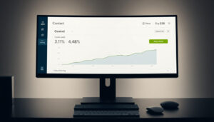
Case Study: Removing Cart Drawer Upsells Lifted Conversion Rate 11.95% for GolfCoursePrint
Cart abandonment is not always caused by price hesitation or a poor checkout flow, sometimes the cart itself is the problem. For GolfCoursePrint, heatmap analysis revealed that suggested upsell products below the cart items were generating significant clicks, but those clicks were pulling users back into browsing mode rather than toward checkout. The cart-to-checkout rate was 35.44%, well below the 50–70% benchmark. Removing the upsell carousel entirely eliminated the distraction loop. The result: a 11.95% conversion rate uplift and an estimated $692,213 in additional annual revenue. The cart is where the purchase decision has already been made, the only job of the cart page is to confirm it.