Shopify product page optimization starts with the questions that stand between a shopper and a purchase: What is it? Is it right for me? What will it cost? Which option should I choose? Make those answers easy to find, then give shoppers a clear way to buy.
This guide uses one Esellence redesign concept to explain those decisions. It shows our design reasoning, not measured conversion gains. There is no single layout, image count, or conversion rate that proves a product page will work.
A quick visual guide to your product page
| Buyer question | What the page should show | How to check it |
|---|---|---|
| What am I buying? | Clear title and useful photos | Can a new visitor name the product? |
| Will it suit me? | Benefits, size guide, and options | Can shoppers choose the right version? |
| What will it cost? | Price and delivery details | Are extra costs easy to find? |
| Can I trust this store? | Real reviews and return terms | Can shoppers check the evidence? |
Made-up numbers to explain the maths. These are not client results or targets.
In this example, 36 ÷ 120 × 100 = 30% of carts lead to a purchase. Check both steps before deciding what to fix. Use the same visitor or session rules at every step.
See the annotated Sleepy Doe example below.
What “Above the Fold” Means for a Shopify Product Page
Above the fold means everything visible on the screen before the buyer scrolls. The visible space varies with the device, browser controls, announcement bar, and header.
On mobile, start with a useful image and a clear route to the product information and purchase controls. Do not shrink text or hide important choices just to squeeze every element into the first screen. Check the page on real screen sizes, and test whether shoppers can find what they need.
The Product Page Elements That Move Conversion Rate
The Product Title and Price
Keep both easy to find near the purchase controls. The title should be clear and descriptive. Avoid clever names that do not tell the buyer what the product actually is. The price should be prominent and easy to find. If you offer multiple variants at different price points, show the price range clearly.
The Primary Product Image
Choose the opening image around what shoppers need to judge. Clothing may need a clear view of the fit; food may need a pack shot and serving view. Include useful detail and scale images, and make gallery navigation easy to spot. Video is useful when it explains something a photo cannot; it is not automatically the better choice.
Compress all images before uploading. An uncompressed 4MB product image is one of the most common causes of slow Shopify product pages. Compare the compressed image with the original at the size shoppers will see. Preserve details that matter to the purchase.
Social Proof Near the Button
If genuine product reviews exist, show the rating and count near the product summary and link to the full reviews. Keep the count visible: one review and hundreds of reviews do not carry the same weight. Do not invent ratings or use store-wide feedback as though it belongs to one product.
A short, genuine review excerpt can address a specific concern such as fit or comfort. Keep its meaning intact, identify its source, and test its placement rather than promising a lift.
Benefit Bullet Points
A bullet list of three to five key benefits, placed above or just below the fold, gives buyers the information they need to decide quickly. Each bullet should state a benefit, not a feature. “Stays warm for 12 hours” is a benefit. “Double-walled stainless steel construction” is a feature. Both can be included, but lead with the benefit.
Keep bullets short enough to scan. Natural wrapping is fine; do not make the text smaller just to force one line.
The Add-to-Cart Button
The button should be a high-contrast colour that stands out clearly from the page background. It should say “Add to Cart” rather than a clever alternative. Use a label that describes the next action. Make the button large enough to tap easily on a touchscreen: at least 48 pixels tall.
What to Put Below the Fold
Below the fold is where you support the decision that buyers have already started to form. Place your full product description, a size guide if relevant, shipping and returns information, a full review block, and any comparison tables or FAQs here.
Keep essential purchase information close to the choices it affects. A size guide belongs beside size selection; delivery costs and return conditions should be easy to find near the purchase area. Longer explanations can sit below without making the first screen crowded.
What does product page optimization look like in practice?
This example explains the changes proposed in our Sleepy Doe redesign. It reviews the supplied screenshots, not the brand’s current site. Product claims, prices, policies, and review figures still need checking before use.
Sleepy Doe: make fit and purchase information easier to find
Numbered notes explain the proposed layout. This is a design concept, not a tested result.
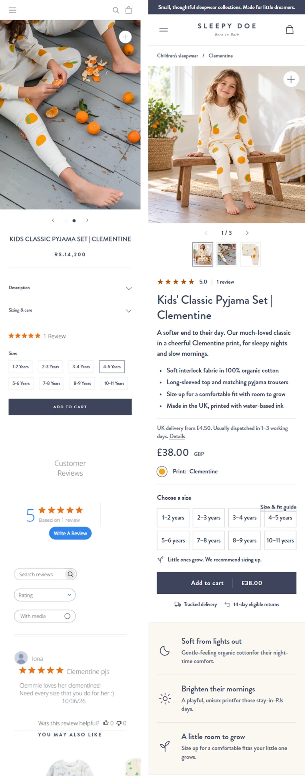
What we observed: The original mobile screenshot shows description and sizing sections above the size choices. The proposed layout brings short product details into the summary and places a size-guide link beside the size buttons.
What we changed and why: The concept uses a fuller view of the pyjama set and groups the product summary, delivery information, price, and size selection into a clearer reading order. The aim is to help a parent assess the item and choose a size with less searching. The original already has review stars and size buttons; the redesign reorganizes that information rather than introducing it.
What needs care: The screenshots show different currencies, so this is not evidence of a price reduction. The proposed gallery imagery must accurately show the item and print. Any material, sizing, dispatch, or returns statement needs brand confirmation before use.
What we would test: Can shoppers find the size guidance and delivery information, select the intended size, and add the item without errors? Track completed purchases and size-related returns alongside add-to-cart behavior.
How should you use this example on your own store?
Start with a buyer question, not a visual trend. Check whether your page already answers it, propose one focused change, and define how you will assess it. Baymard’s product-page usability research covers galleries, variations, shipping, and returns. This example shows how to review those areas. The research does not guarantee a result for this redesign.
For the wider process, see our Shopify CRO guide.
Understanding Product Page Psychology: Why Visitors Don’t Buy
Before changing the page, look at the main reasons shoppers may decide not to buy:
Barrier 1: Doubts about product quality. Shoppers cannot touch or try your product online. They use your photos and descriptions to judge its quality. Missing or unclear images can leave them unsure.
Barrier 2: An unclear reason to buy. Shoppers need to know why they should choose your product over a similar one. Explain what makes it useful and different. A list of features alone may not answer that question.
Barrier 3: Worries about the purchase. Will the product look as expected? Will it arrive on time? Can I return it? Clear delivery and return details help shoppers weigh these risks.
Barrier 4: Too many choices at once. A long list of options, competing buttons, or too much text can make the next step unclear. Group related choices and explain what shoppers need to select.
Barrier 5: A lack of trust. New visitors may not know your brand yet. Real reviews, clear contact details, and honest policies help them decide whether to trust your store.
How to Know If Your Product Page Is Underperforming
Compare the same product and metric definition over time, split by device and traffic source. A low add-to-cart rate can reflect the offer, price, visitor intent, stock, or the page experience. A high rate does not prove the page is healthy if purchases or margin fall. Use page behavior, customer questions, and completed purchases to decide what to investigate.
In the Shopify CRO free audit, I will review your product page structure and identify the top issues for your store. Our Shopify conversion rate optimization service covers your full buying journey.
Show enough context to identify the product and make the next step clear. The exact first screen varies by device. Keep price, required options, and the purchase action easy to find without cramming every detail into one screen.
Use enough images to answer questions about appearance, detail, size, and use. Each image should add information. There is no fixed count that guarantees better sales.
Show a genuine product rating and count near the summary, with access to full reviews. Keep product reviews distinct from store-wide feedback and do not invent proof when reviews are unavailable.
Compare consistent metrics by device and traffic source, then look for unanswered questions and selection errors. Check completed purchases as well as add-to-cart behavior. A single benchmark cannot diagnose the page.