A useful Shopify product page template groups images, the title, price, options, reviews, and the buy button so shoppers can find what they need. Add short benefits and clear delivery and return details. Use the layout below as a starting point, then adjust it to your product and buyers.
The Layout Structure of a High-Converting Product Page
Most Shopify themes place the product image on the left and the product details on the right on desktop. On mobile, this stacks the image first, then details below. Both layouts work, but each element within the details column needs to be in the right order to maximise conversion rate.
Here is a starting order to test with your own product and buyers:
- Product name (H1)
- Price and variant selector (size, colour, or other options)
- Star rating and review count (linked to the review block below)
- Benefit bullet list (three to five lines)
- Add-to-cart button (full width on mobile)
- Trust line (e.g., “Free UK delivery over £40. Free returns within 30 days.”)
- Short product description (three to five sentences)
- Expanded details or tabs (materials, dimensions, care instructions)
- Full review block
Plan the layout around buyer questions
| Page area | What to include | Buyer question |
|---|---|---|
| Product summary | Title, price, benefits, and real rating | What is this? |
| Buying choices | Size options and nearby guidance | Which version suits me? |
| Purchase area | Buy button, delivery, and returns | What happens when I order? |
| More detail | Gallery, care, and full reviews | What else should I check? |
Above the Fold: Make the Next Step Clear
The first screen varies by phone, browser, and header size. Help shoppers identify the product and find the buying choices. Do not squeeze every detail into that space.
Check the page on a real phone. Can shoppers find the price, choose an option, and reach the button easily? A browser preview helps, but it may not match the space taken up by a phone’s browser controls.
The Product Image Block
Use at least four images. The first should be a clean product shot on a white or very light background. Follow this with: a second angle or the back of the product, a lifestyle image showing it in use, and a scale image showing the size relative to a familiar object or on a person.
If you have product video, place it as the second or third item in the gallery, after the primary hero shot. Use video when it answers a question that photos leave unclear. Its effect on sales needs testing.
The Benefit Bullet List
A short benefit list helps shoppers see the product’s value before they reach the button. Write each bullet as a benefit, not a feature. “Keeps drinks cold for 24 hours” is a benefit. “Vacuum-insulated double-wall construction” is a feature.
You can include both, but write the benefit first and the feature second if you want to include it: “Cold for 24 hours, thanks to vacuum-insulated double walls.” Keep each bullet short and useful. Let it wrap naturally on mobile, and remove points that repeat the same idea.
The Trust Line
Place a short trust line directly below the add-to-cart button. This should address the two most common objections at the point of purchase: delivery time and returns. Keep it to one or two lines maximum.
Examples: “Free UK delivery in 2 to 3 days. Free returns within 30 days.” or “Ships today if ordered before 2pm. Easy returns.” Buyers who see this line after clicking add to cart are more likely to continue to checkout rather than pause to check your returns policy separately.
Example: how we grouped The Vow’s buying details
In our proposed The Vow layout, we grouped the product summary, size choices, and main button. The original already had useful photos and reviews. This concept changes how shoppers find that information; it does not show a measured sales gain.
Proposed redesign. Numbers explain the layout choices.
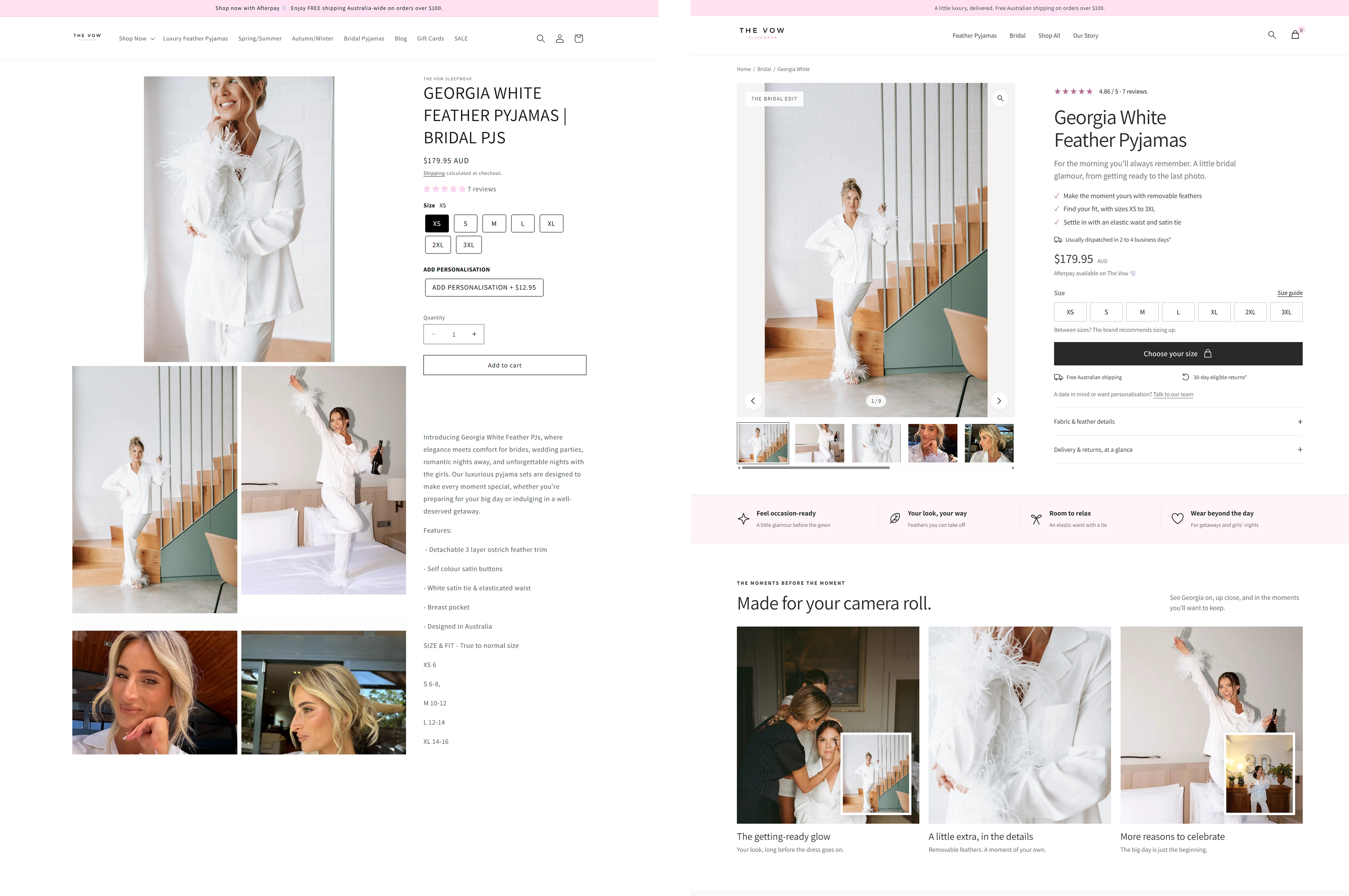
Keep the buying options: The original page offers paid personalisation. A simpler layout must still let shoppers add it and see the correct total in the cart. Confirm fit, delivery, and return details before launch.
Check the result: Ask shoppers to find a size, choose any personalisation, and add the item. Record errors and questions. Then check completed orders as well as button clicks.
For a deeper review of product information, see our product page optimization guide.
Common Template Mistakes That Hurt Conversion Rate
- Placing the review block only at the bottom of a very long page, below several tabs and an FAQ section
- Using a full-screen hero image that pushes the add-to-cart button below the fold on mobile
- Showing variant selectors (size, colour) after the add-to-cart button rather than before
- Including a pop-up discount offer that fires immediately on page load before the buyer has read anything
- Using tabs to hide key product information that buyers need to make a decision
How to Measure If Your Template Is Working
Compare add-to-cart and purchase rates over time, using the same definitions. Split the results by device and traffic source where possible. A low rate is a reason to investigate, not proof that the layout is at fault.
If you want feedback on your product page layout, the free audit identifies the top three issues on your page. For stores ready to redesign and rebuild the product page layout, the CRO engagement handles the implementation.
Include useful images, a clear title, price, buying options, a buy button, and delivery and return details. Add real reviews where available. Arrange the page around the questions buyers need answered.
Place a real rating and review count near the product summary. Link it to the full reviews so shoppers can read more. Test the placement with your buyers.
Use enough images to explain the product’s appearance, details, size, and use. Each image should add useful information. Reduce file sizes while keeping important details clear.
A theme can provide the basic layout. Check how your own images, text, buying options, and apps work together on a real phone before launch.